SPARK!
a fun-filled adventure in science to ignite your mind and imagination
THIS IS A TEST
a look inside the role animals play in the advancement of scientific research
THE POOL
step into the world of genetics the story of humanity

Showing posts with label viscom2. Show all posts
Showing posts with label viscom2. Show all posts
4.15.2011

4.08.2011
VISCOM 2: final infographs

linear progression of "what we take with us"
For the following set of infographs, I wanted to carry the strong visual impression of my icons through to the forms of the graphs. I took the angular and distorted aspects of the icons and used it to inform framing devices for the info. My color choices, though I never fessed up to it in class, are classic halloween colors you'd find on an elementary school bulletin board. Those colors in a subtle way give the impression of "spooky" or "horror" but in a fun, accessible way that I believe my icons communicate as well. I really enjoyed this "fun" approach when contrasted with some heavy and disturbing facts. It's just the twisted sense of humor I appreciate, and it communicates the mania of the MAD SCIENTIST (boom crash).


3.11.2011
VISCOM 2: final icon set reflection
These final icons were built to represent the electricity, excitement and eccentric nature of the mad scientist (check it. three "e"s). The abstracted, angular forms give insight into the mad scientist's broken logic.
The icons are built from negative space carved out of what became a block of spikes. To keep the icons cohesive, every form was kept as uncluttered as possible and still maintain legibility. These "simple" forms allowed me to have breathing room within the spikes and avoid problems when scaled down to the required half-inch size. I had a corner or edge of the icon break the boundary of the spike form so that the entire unit could be read as a single, whole form, rather than an icon within the spikes.

I originally began the icon set based in analog origins using ink splatters. The splatter motif was inspired by my culture book in which I used the form to accompany images of lab coats. I thought the splatter would be a nice, self-contained form that would convey the "horror" origins of mad scientist lore. From there, I cut out very basic forms of images pulled from the same culture book. This process helped me see the necessary information required to illustrate the icon, and extra information that wasn't needed that I sure as hell didn't want to try to carve out with an exact-o knife. From there, I traced over these splatters so I could gain more control over the manipulation of the form than ink and gravity would allow. Eventually, I streamlined the splatter into larger, more even shapes so that the icon and splatter would unify into a cohesive form. This was the point where the identity of the icons really took shape. As an instructor-inspired move in a different direction, I took these streamlined forms and threw them in the opposite direction, shifting the curvilinear forms into a wild, angular, and angsty direction. This move took the icons in a more electric direction, and with some re-working of the icon, produced a cohesive and energetic set. For color, I was inspired by a shot of a lab coat where green and purple lights were bouncing around the background. I thought the colors were good indicators of science experiments, potions, fumes and vapors, and even the classic green of Frankenstein's monster and decaying flesh. Since my forms were already so abstracted, I chose the soft color change of the gradient because I thought it the best solution that didn't distract or confuse the form of the icon. It also supports the "glow" of the toxic fumes and electricity that inspired the set.


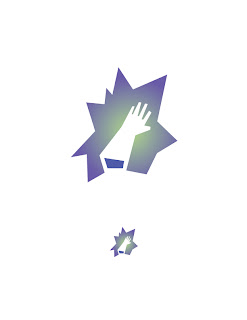
The icons are built from negative space carved out of what became a block of spikes. To keep the icons cohesive, every form was kept as uncluttered as possible and still maintain legibility. These "simple" forms allowed me to have breathing room within the spikes and avoid problems when scaled down to the required half-inch size. I had a corner or edge of the icon break the boundary of the spike form so that the entire unit could be read as a single, whole form, rather than an icon within the spikes.

I originally began the icon set based in analog origins using ink splatters. The splatter motif was inspired by my culture book in which I used the form to accompany images of lab coats. I thought the splatter would be a nice, self-contained form that would convey the "horror" origins of mad scientist lore. From there, I cut out very basic forms of images pulled from the same culture book. This process helped me see the necessary information required to illustrate the icon, and extra information that wasn't needed that I sure as hell didn't want to try to carve out with an exact-o knife. From there, I traced over these splatters so I could gain more control over the manipulation of the form than ink and gravity would allow. Eventually, I streamlined the splatter into larger, more even shapes so that the icon and splatter would unify into a cohesive form. This was the point where the identity of the icons really took shape. As an instructor-inspired move in a different direction, I took these streamlined forms and threw them in the opposite direction, shifting the curvilinear forms into a wild, angular, and angsty direction. This move took the icons in a more electric direction, and with some re-working of the icon, produced a cohesive and energetic set. For color, I was inspired by a shot of a lab coat where green and purple lights were bouncing around the background. I thought the colors were good indicators of science experiments, potions, fumes and vapors, and even the classic green of Frankenstein's monster and decaying flesh. Since my forms were already so abstracted, I chose the soft color change of the gradient because I thought it the best solution that didn't distract or confuse the form of the icon. It also supports the "glow" of the toxic fumes and electricity that inspired the set.



3.03.2011


2.21.2011
VISCOM 2: analog icon


2.11.2011
VISCOM 2: presentation
Because the mad scientist lives in a fictitious, fantastic world, I took that approach with my presentation. In it, I attempt to paint a picture in the viewer's minds-eye of a dark mind that is gripped tighter and tighter by insanity. I wanted to establish this character who lives in a morally gray area, willing to cross the line of decency in the defense and pursuit of science. Through each spread, I will illustrate the archaeological evidence presented and place it in its setting, also describing its use in the mad scientist's experiments.


2.07.2011
VISCOM 2: mock up critique
PRINTING
Unfortunately with duplex printing (at least on the east printer), there is a discrepancy between the front and back alignment of a little over an eighth of an inch. This creates problems in alignment across the spreads. If I were to bypass the duplex printing and adhere the pages together, there would be too much bulk to staple through. I need to test how the konica handles the duplex, though I think it has the same problem.
PHYSICAL CRAFT
My covers are mostly black. When the paper is creased, the toner cracks along the edge leaving nasty white spiderwebs along the edge of the crease. Also, my ruler easily scrapes the toner off the page. I'll need to lay down a piece of paper to protect the page from the ruler.
DIGITAL CRAFT
My cutouts don't look bad against a white background, but if i were to put a color or an image in the background, it would most likely reveal areas i need to clean up.
COVER
I think the image works great, and the quality of the image certainly improves when printed on the konica versus the east printer. I may italicize "MAD SCIENTIST" again. I think the angle adds tension to the title and reinforces the horror flick influence of the cover. The size relationship between "MAD SCIENTIST" and the subtitle needs more fudging, perhaps by bringing down the size of the subtitle.
SPREAD FORMAT
The four-block format does a great job of showcasing the images, and the layered cutouts add depth to the page and gives a three dimensional quality to the cutouts. The format works best when the images create a clear square shape. The images with white backgrounds don't work as well. The extra white space surrounding the complex shapes of the artifacts disrupt the flow across the spreads. Blocks were left open intentionally so that the spreads breathe through the white space. The labcoat and brains spreads I think could both use another image.
PRESENTATION
There's a serious disconnect between the cover's dark, horror flick feel and the inside spreads. The spreads feel clinical by comparison. I'd like to see if there's and image I could put in the background of spreads, possibly of a mad scientist's dungeon. Black and white Dr. Frankenstein style.
Unfortunately with duplex printing (at least on the east printer), there is a discrepancy between the front and back alignment of a little over an eighth of an inch. This creates problems in alignment across the spreads. If I were to bypass the duplex printing and adhere the pages together, there would be too much bulk to staple through. I need to test how the konica handles the duplex, though I think it has the same problem.
PHYSICAL CRAFT
My covers are mostly black. When the paper is creased, the toner cracks along the edge leaving nasty white spiderwebs along the edge of the crease. Also, my ruler easily scrapes the toner off the page. I'll need to lay down a piece of paper to protect the page from the ruler.
DIGITAL CRAFT
My cutouts don't look bad against a white background, but if i were to put a color or an image in the background, it would most likely reveal areas i need to clean up.
COVER
I think the image works great, and the quality of the image certainly improves when printed on the konica versus the east printer. I may italicize "MAD SCIENTIST" again. I think the angle adds tension to the title and reinforces the horror flick influence of the cover. The size relationship between "MAD SCIENTIST" and the subtitle needs more fudging, perhaps by bringing down the size of the subtitle.
SPREAD FORMAT
The four-block format does a great job of showcasing the images, and the layered cutouts add depth to the page and gives a three dimensional quality to the cutouts. The format works best when the images create a clear square shape. The images with white backgrounds don't work as well. The extra white space surrounding the complex shapes of the artifacts disrupt the flow across the spreads. Blocks were left open intentionally so that the spreads breathe through the white space. The labcoat and brains spreads I think could both use another image.
PRESENTATION
There's a serious disconnect between the cover's dark, horror flick feel and the inside spreads. The spreads feel clinical by comparison. I'd like to see if there's and image I could put in the background of spreads, possibly of a mad scientist's dungeon. Black and white Dr. Frankenstein style.
2.03.2011


1.26.2011
VISCOM 2: cultural artifacts! edited. fudged. finalized.
I've decided to move forward with the MAD SCIENTIST (lightning strike. thunder clap) because on the list of cultural candidates, the MAD SCIENTIST (via the initial launch word of "inventor") route stuck in my mind as being full of wacky potential. Jamie snuck a hint/warning that these early decisions will potentially set the course for the rest of the semester, so I went with the option that I thought could provide me with the most inspiration, the most imagery, and the most personal entertainment. I mean, I get to do things like add sound effects after the words MAD SCIENTIST and it somehow seems appropriate.
Sounds like a blast, really.
MAD SCIENTIST (bubbling, evil cackle)
lab rats
chemistry equipment
lightning rod
brains
goggles
rubber gloves
oversized switches
lab coat
lab assistant/grunt
Sounds like a blast, really.
MAD SCIENTIST (bubbling, evil cackle)
lab rats
chemistry equipment
lightning rod
brains
goggles
rubber gloves
oversized switches
lab coat
lab assistant/grunt
1.24.2011
VISCOM 2: cultural describers and artifacts
BLUE COLLAR
-hard working, conservative, tough
traditional, patriotic,
thermos
pick-up truck
six-pack
lunch pail
hard hat
skoal can
dickies
muddy boots
broken radio
tool belt
hank williams jr. cassette
tool box
MAD SCIENTIST
-recognition, world domination, discovery,
immortality, secularism, creation
lab coat
tesla coil
lab rats
beakers
lightning rods
goggles
rubber gloves
chemicals
workbench
large switches
brains in jars
igor
-hard working, conservative, tough
traditional, patriotic,
thermos
pick-up truck
six-pack
lunch pail
hard hat
skoal can
dickies
muddy boots
broken radio
tool belt
hank williams jr. cassette
tool box
MAD SCIENTIST
-recognition, world domination, discovery,
immortality, secularism, creation
lab coat
tesla coil
lab rats
beakers
lightning rods
goggles
rubber gloves
chemicals
workbench
large switches
brains in jars
igor
Subscribe to:
Posts (Atom)