

we began the project by researching current magazines on the
newstands, and looking about how they employ the grid, hierarchy, and
composition throughout their magazine. i chose a magazine called worth,
an upscale financial magazine obviously geared towards business and
market types. i chose the magazine not only because i thought the
layouts were aesthetically pleasing,
but because i thought the layouts also reflected the subject matter
conceptually. the environment was controlled and compartmentalized, but
inside the active area of the magazine the layouts were open, well
spaced and ordered. this reflected a peace or calm within a fixed
system... therefore reflecting the logic and security of the information
provided in the magazine.
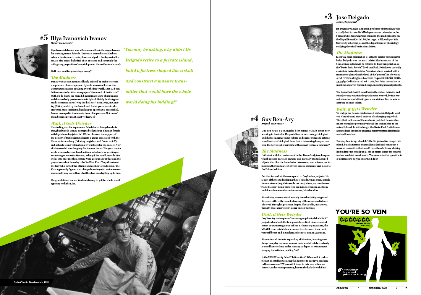
my own magazine needed to reflect the "culture" of the mad scientist; an import from viscom 2. because the mad scientist created, bombastic, and colorful images in the mind, i wanted the magazine to carry that energy in the spreads.
the first way to present that feeling was the dimension of the spreads. i chose an exceptionally large format (each spread was a combined 20 X 14 inches). in your hands, the spreads are a little overwhelming and unwieldy. having such a large page size also allowed me the space to really use dynamic imagery, which i especially used to my advantage in the opening spread. the viewer is greeted with a frankly unsettling image of a madman.
because a requirement of the assignment was to incorporate infographs created in viscom 2 in our spreads, i chose to adopt the treatment of the graphs for the way i handled the images. the images were cropped and fractured into triangles and accented with a bright green stripe. the strong angles created by these shapes created dynamic leading lines in the composition which directs the readers eye through each spread.


as we developed the magazine layouts, another dimension was added to the project. we now needed to develop and adapt the magazine spreads to the ipad. as technology expands and print dies out, magazines have begun to move towards tablet computing, especially the ipad. downloaded as an ap, the magazine can expand its content to include videos, sound bytes, and user interactivity, as well as provide a mobile, direct link to the online marketplace for advertisers.
the assignment was to allow our magazines to inform how we developed the ipad interface for the article. the article i chose was a countdown. this naturally allowed for a compartmentalized format. i then chose to take those triangle shapes created in the images of the print spreads, and use them as frames for each of the information compartments. the user could then navigate freely between each compartment of the article, and pull up information on a real life mad scientist and swipe through to provide additional content such as infographs, or even a video clip of a film representation of a mad scientist.


